ggplot
Data Visualization with ggplot2
Basics
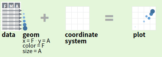
ggplot2 is based on the grammar of graphics, a coherent system for describing and building graphs.
With ggplot2, you can build every graph from the same components:
- a data set
- a coordinate system
- geoms—visual marks that represent data points.
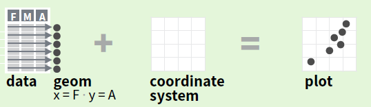
To display values, map variables in the data to visual properties of the geom (aesthetics) like size, color, and x and y locations.
Complete the template below to build a graph.
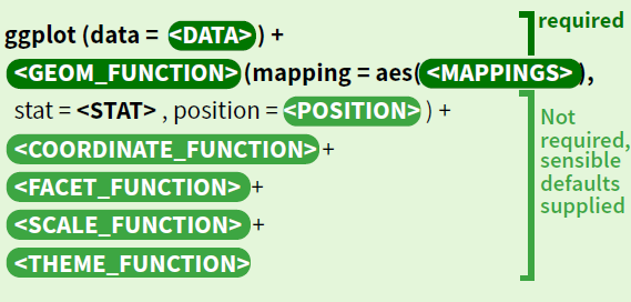
A graphing template
ggplot(data = <DATA>) +
  <GEOM_FUNCTION>(mapping = aes(<MAPPINGS>))
ggplot(data = mpg, aes(x = cty, y = hwy))
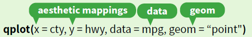
qplot creates a complete plot with given data, geom, and mappings. Supplies many useful defaults.
last_plot() returns the last plot
ggsave(“plot.png”, width = 5, height = 5) saves last plot as 5’ x 5’ file named “plot.png” in working directory.
Aesthetic mappings
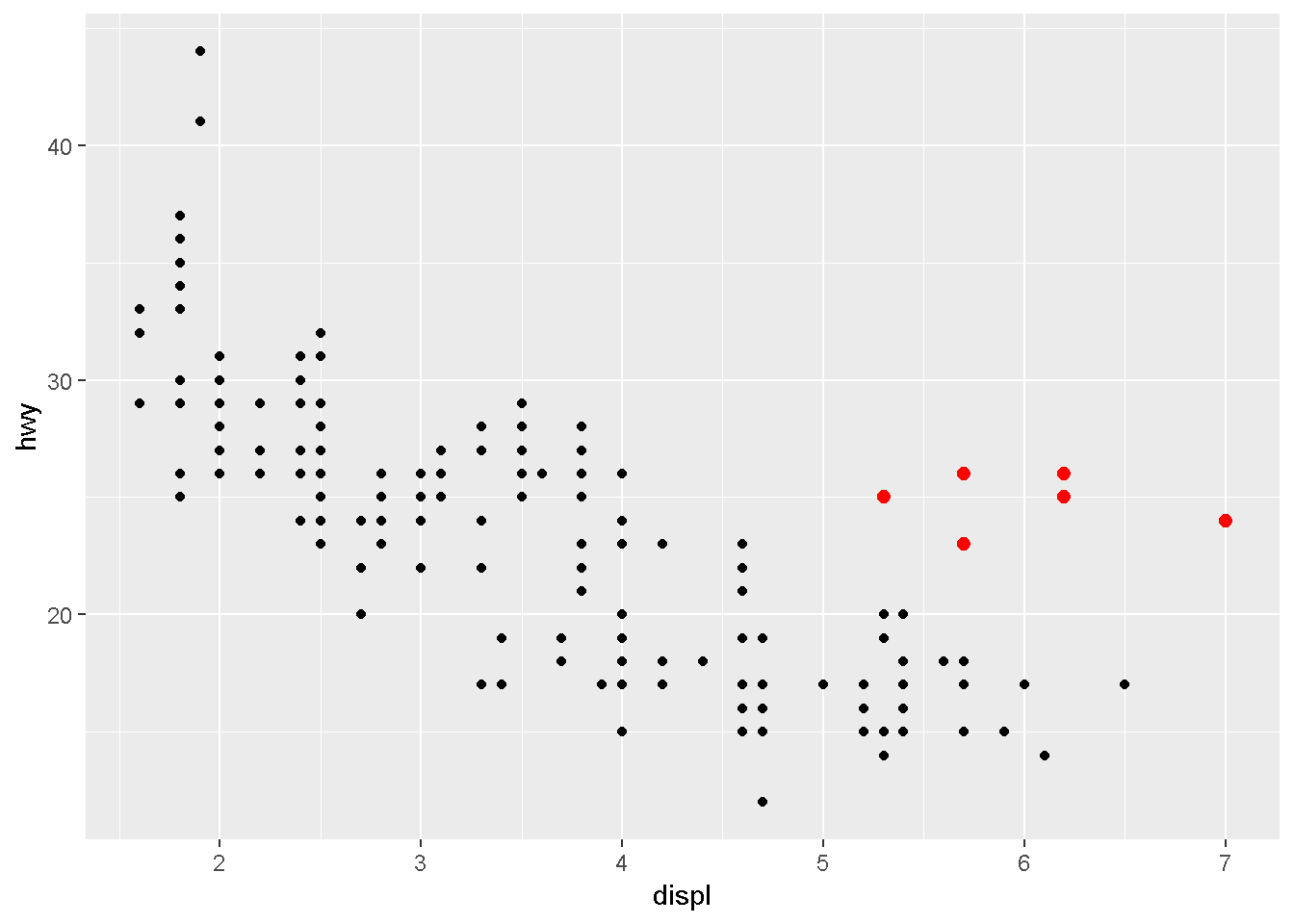
You can add a third varible, like class, to a two dimensional scatterplot by mapping it to an aesthetic. An aesthetic is a visual property of the objects in your plot.
Aesthetics include things like:
- the size,
- the shape,
- or the color of your points.
class
ggplot(data = mpg) +
  geom_point(mapping = aes(x = displ, y = hwy, color = class))
size
ggplot(data = mpg) +
  geom_point(mapping = aes(x = displ, y = hwy, size = class))
## Warning: Using size for a discrete variable is not advised.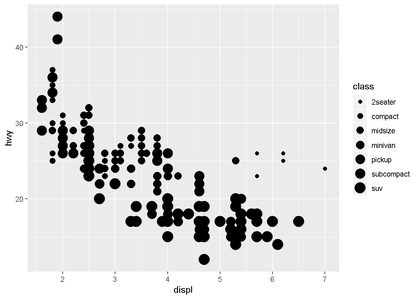
# Left
ggplot(data = mpg) +
  geom_point(mapping = aes(x = displ, y = hwy, alpha = class))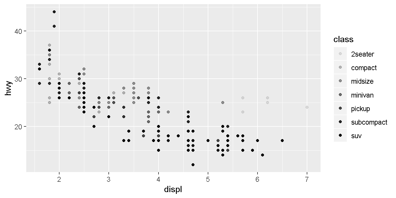
# Right
ggplot(data = mpg) +
  geom_point(mapping = aes(x = displ, y = hwy, shape = class))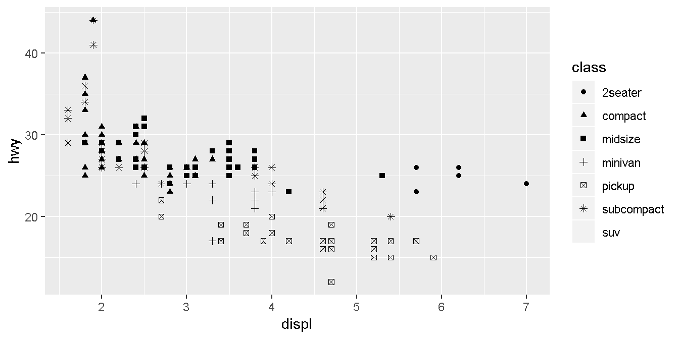
set the aesthetic properties manually - outside of aes()
ggplot(data = mpg) +
  geom_point(mapping = aes(x = displ, y = hwy), color = "blue")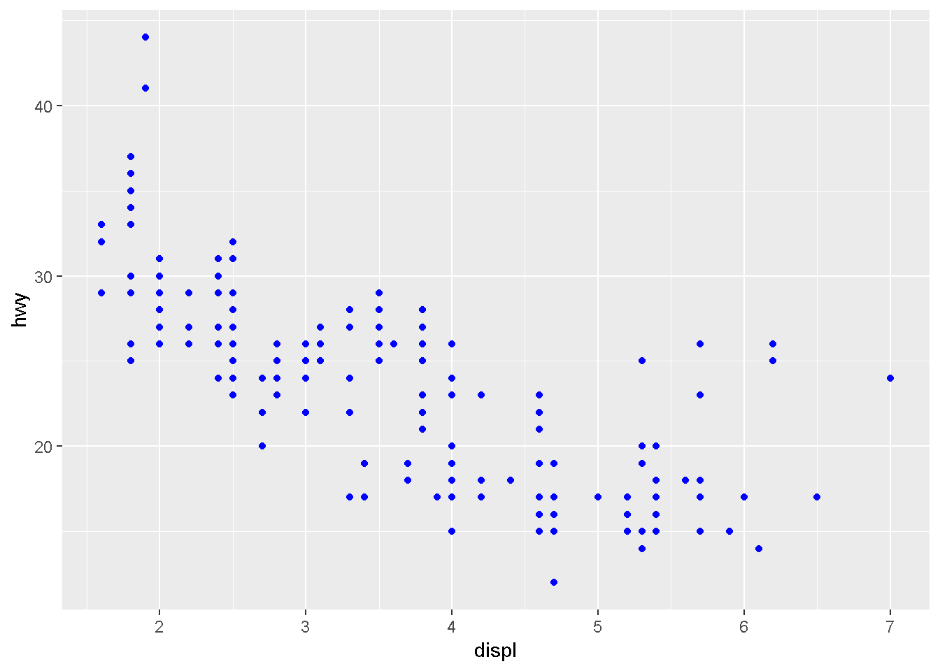
    ggplot(data = mpg) +
      geom_point(mapping = aes(x = displ, y = hwy, color = "blue"))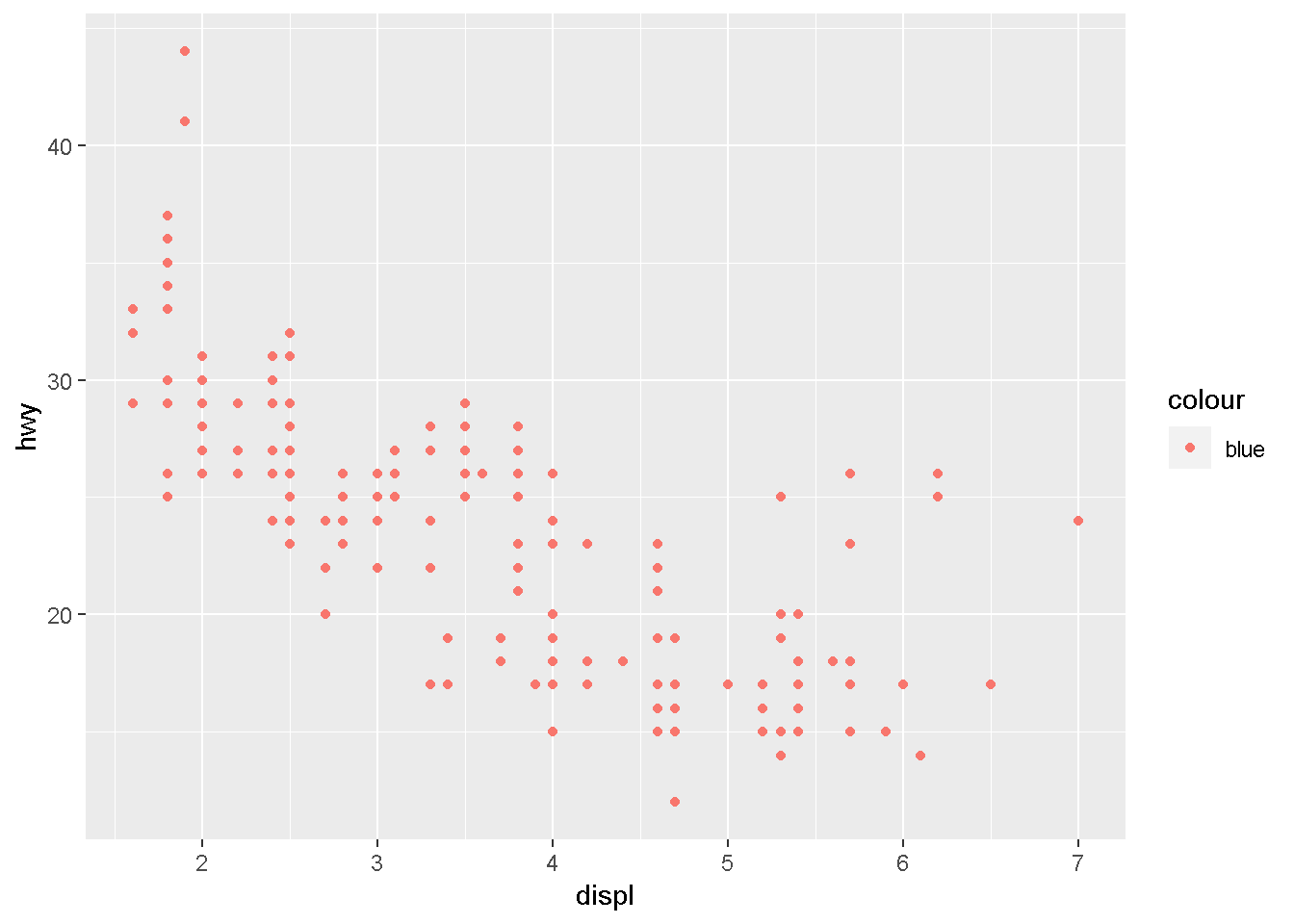
Facets - categorical variables
ggplot(data = mpg) +
  geom_point(mapping = aes(x = displ, y = hwy)) +
  facet_wrap(~ class, nrow = 2)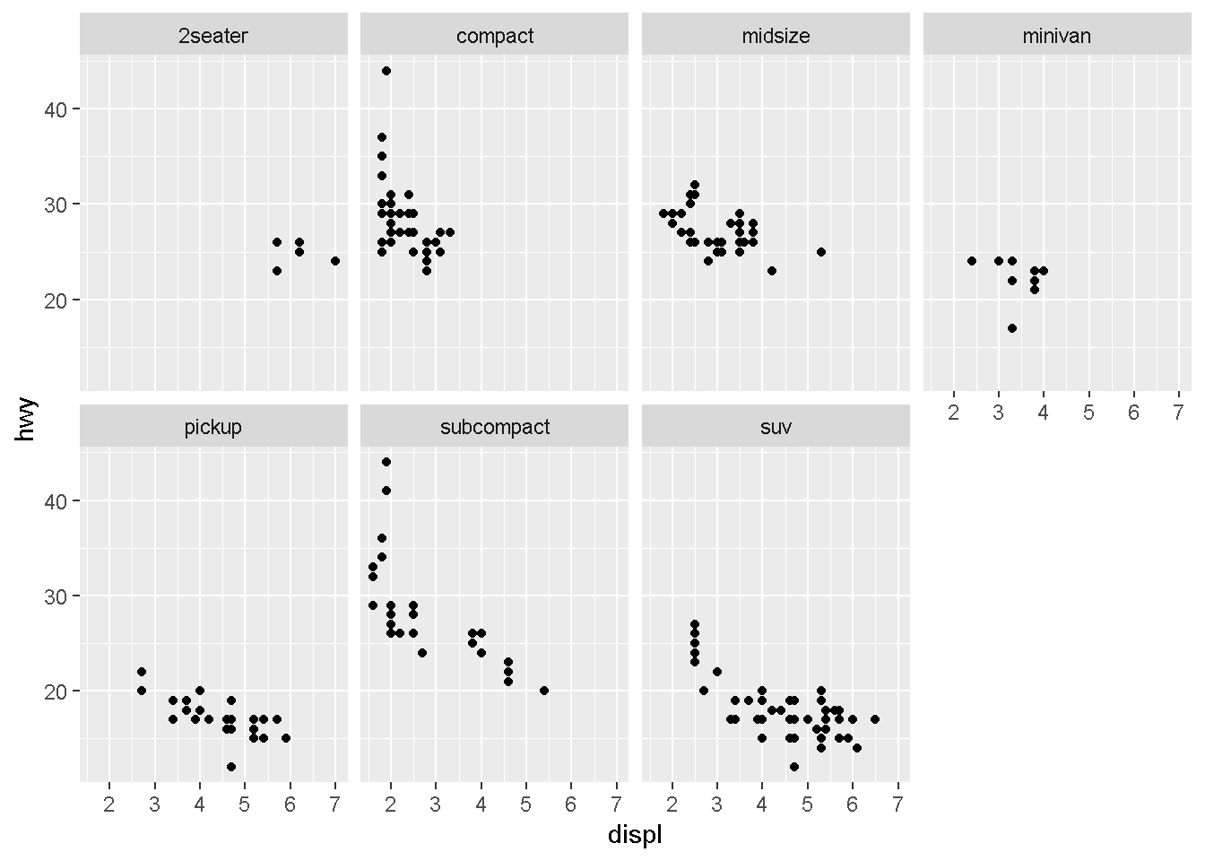
ggplot(data = mpg) +
  geom_point(mapping = aes(x = displ, y = hwy)) +
  facet_grid(drv ~ cyl)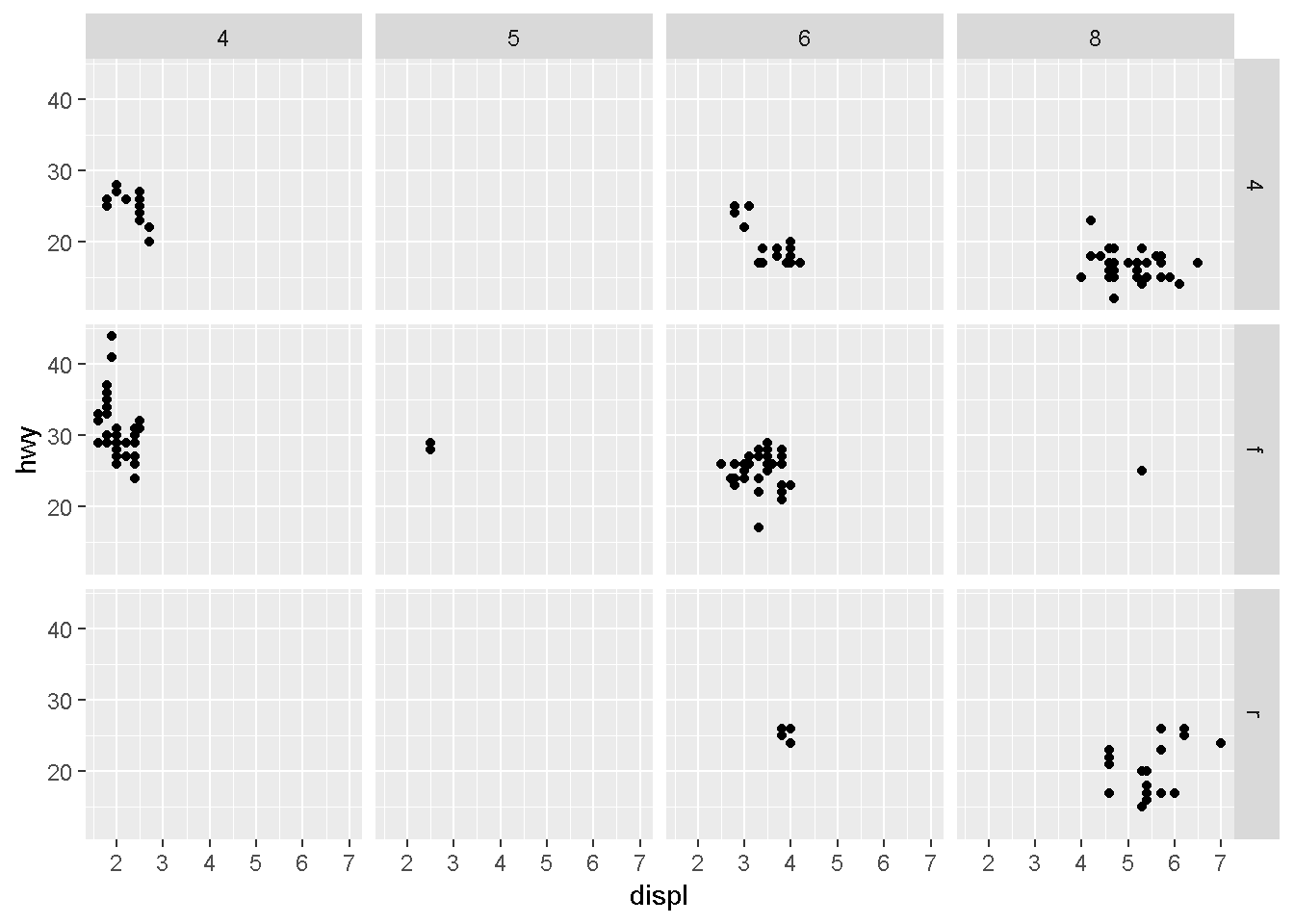
Geometric objects
A geom is the geometrical object that a plot uses to represent data.
ggplot(data = mpg) +
  geom_point(mapping = aes(x = displ, y = hwy))
ggplot(data = mpg) +
  geom_smooth(mapping = aes(x = displ, y = hwy))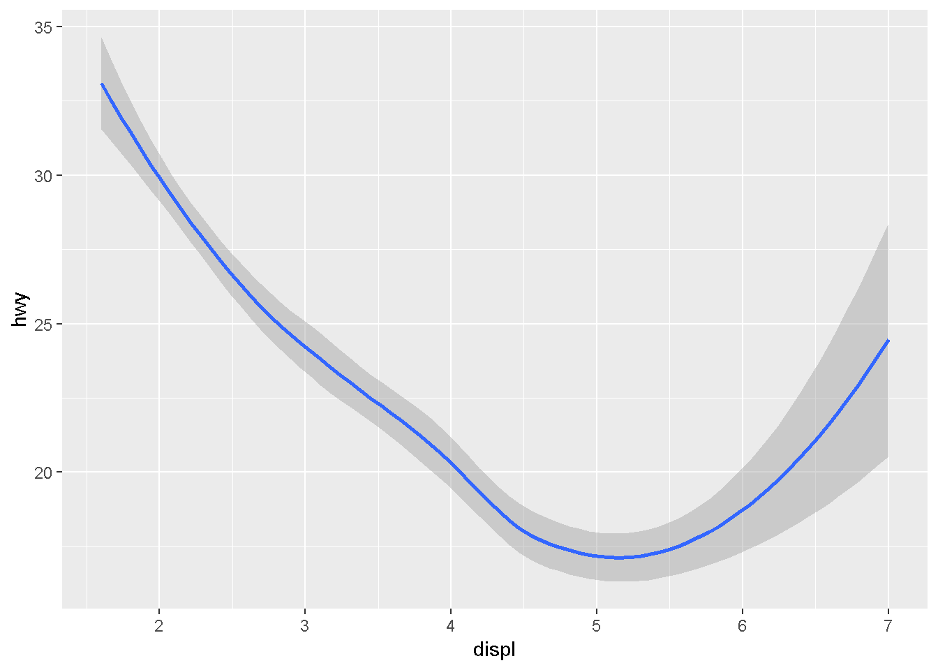
ggplot(data = mpg) +
  geom_smooth(mapping = aes(x = displ, y = hwy, linetype = drv))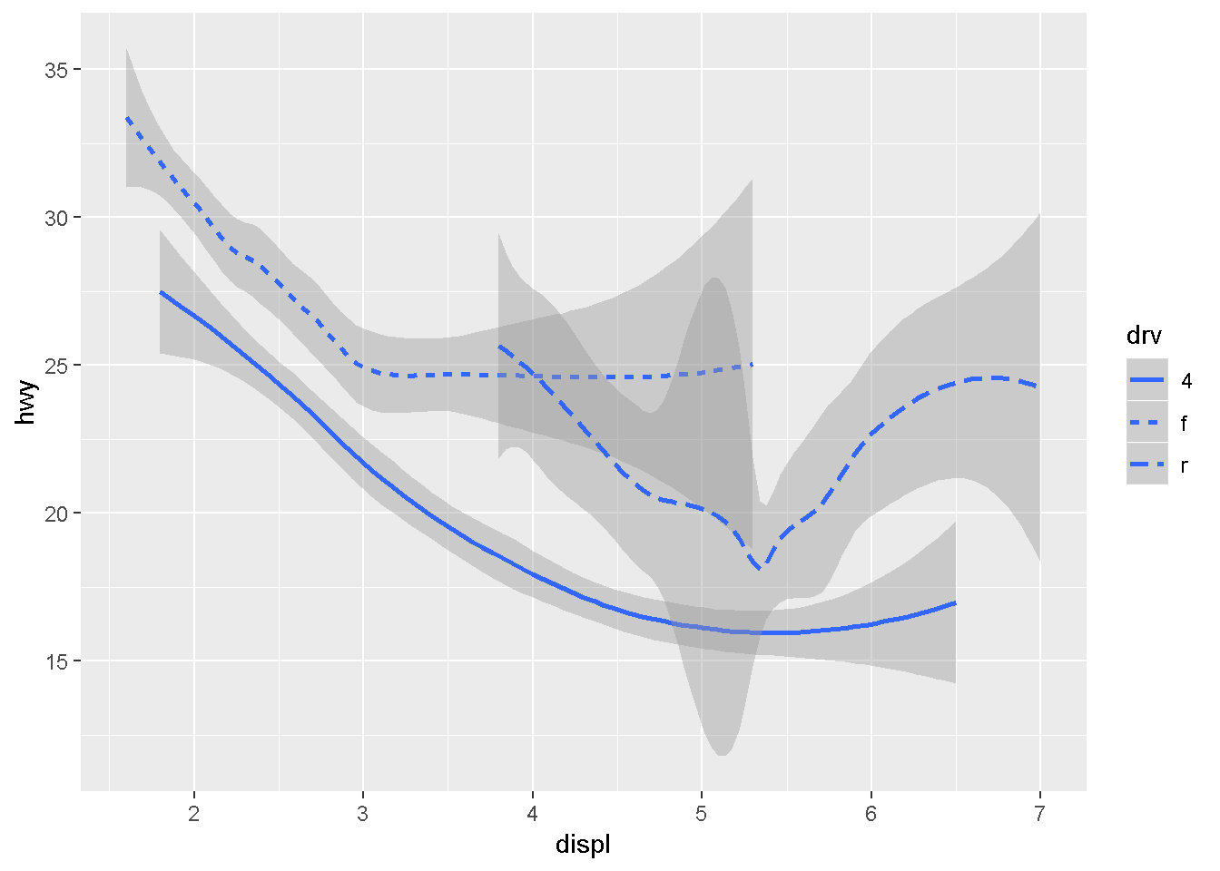
ggplot(data = mpg, mapping = aes(x = displ, y = hwy, color = drv)) +
  geom_point() +
  geom_smooth(mapping = aes(linetype = drv))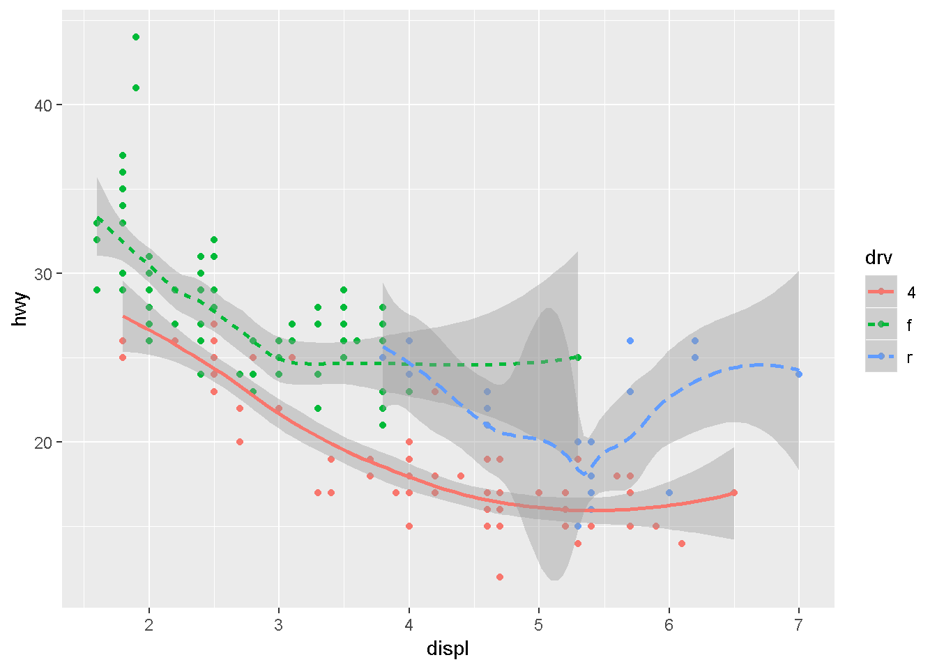
ggplot2 provides over 30 geoms, and extension packages provide even more (see https://www.ggplot2-exts.org for a sampling). The best way to get a comprehensive overview is the ggplot2 cheatsheet, which you can find at http://rstudio.com/cheatsheets. To learn more about any single geom, use help: ?geom_smooth.
In practice, ggplot2 will automatically group the data for these geoms whenever you map an aesthetic to a discrete variable (as in the linetype example).
ggplot(data = mpg) +
  geom_smooth(mapping = aes(x = displ, y = hwy))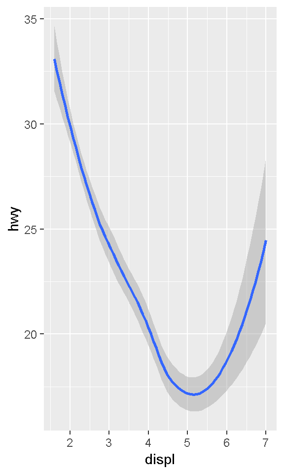
ggplot(data = mpg) +
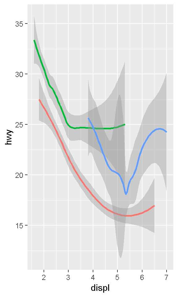
geom_smooth(mapping = aes(x = displ, y = hwy, group = drv))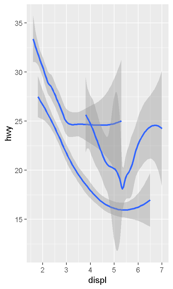
ggplot(data = mpg) +
  geom_smooth(
    mapping = aes(x = displ, y = hwy, color = drv),
    show.legend = FALSE
  )
To display multiple geoms:
ggplot(data = mpg, mapping = aes(x = displ, y = hwy)) +
  geom_point() +
  geom_smooth()
ggplot(data = mpg, mapping = aes(x = displ, y = hwy)) +
geom_point(mapping = aes(color = class)) +
geom_smooth()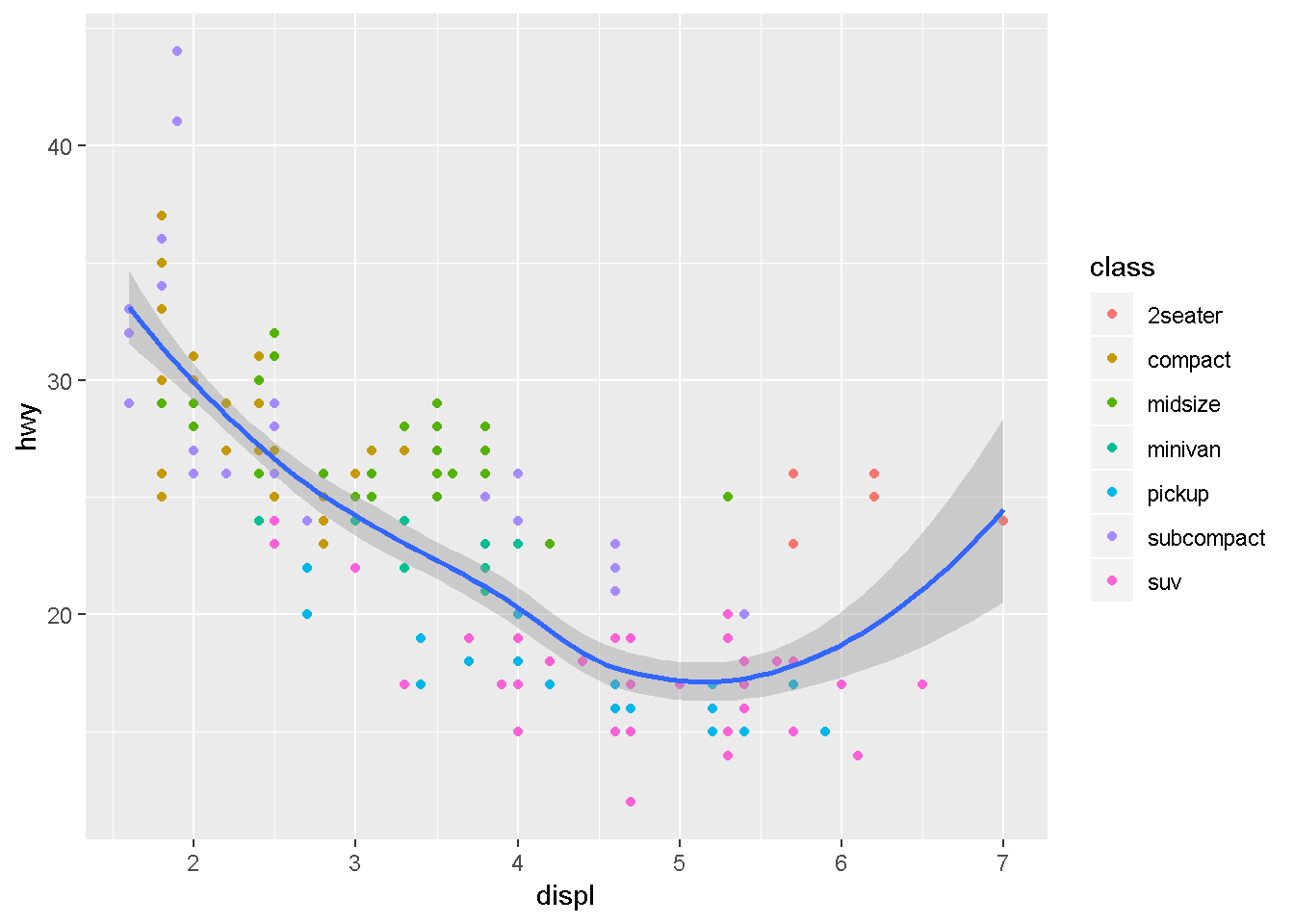
ggplot(data = mpg, mapping = aes(x = displ, y = hwy)) +
  geom_point(mapping = aes(color = class)) +
  geom_smooth(data = filter(mpg, class == "subcompact"), se = FALSE)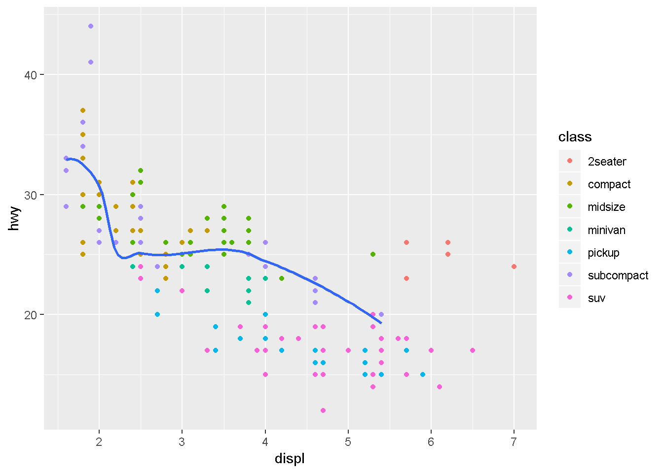
Statistical transformations
The diamonds dataset comes in ggplot2 and contains information about ~54,000 diamonds, including the price, carat, color, clarity, and cut of each diamond.
ggplot(data = diamonds) +
  geom_bar(mapping = aes(x = cut))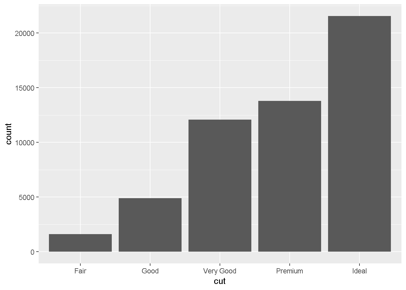
The algorithm used to calculate new values for a graph is called a stat, short for statistical transformation. The figure below describes how this process works with geom_bar().
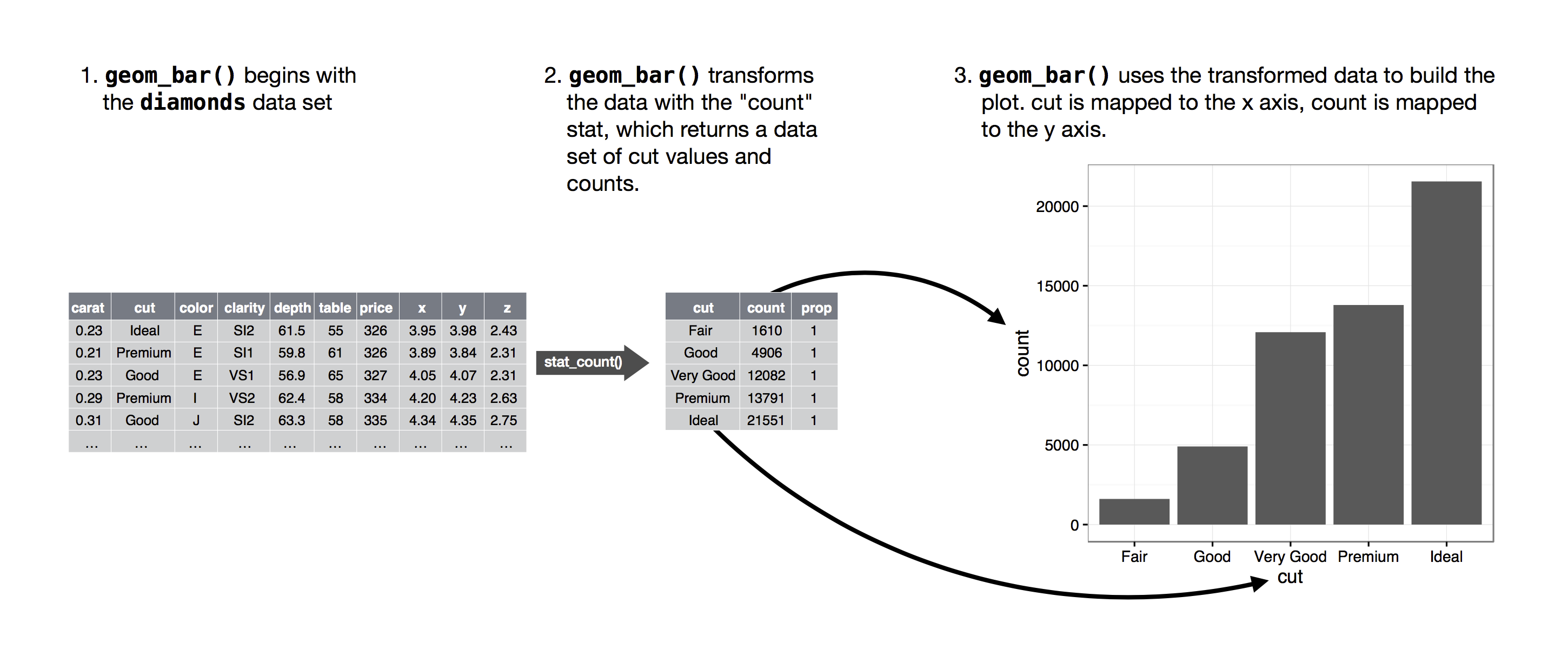
?geom_bar shows that the default value for stat is “count”, which means that geom_bar() uses stat_count().
ggplot(data = diamonds) +
  stat_count(mapping = aes(x = cut))
    demo <- tribble(
      ~cut,         ~freq,
      "Fair",       1610,
      "Good",       4906,
      "Very Good",  12082,
      "Premium",    13791,
      "Ideal",      21551
    )

    ggplot(data = demo) +
      geom_bar(mapping = aes(x = cut, y = freq), stat = "identity")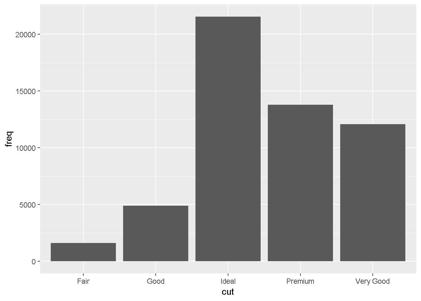
    ggplot(data = diamonds) +
      geom_bar(mapping = aes(x = cut, y = ..prop.., group = 1))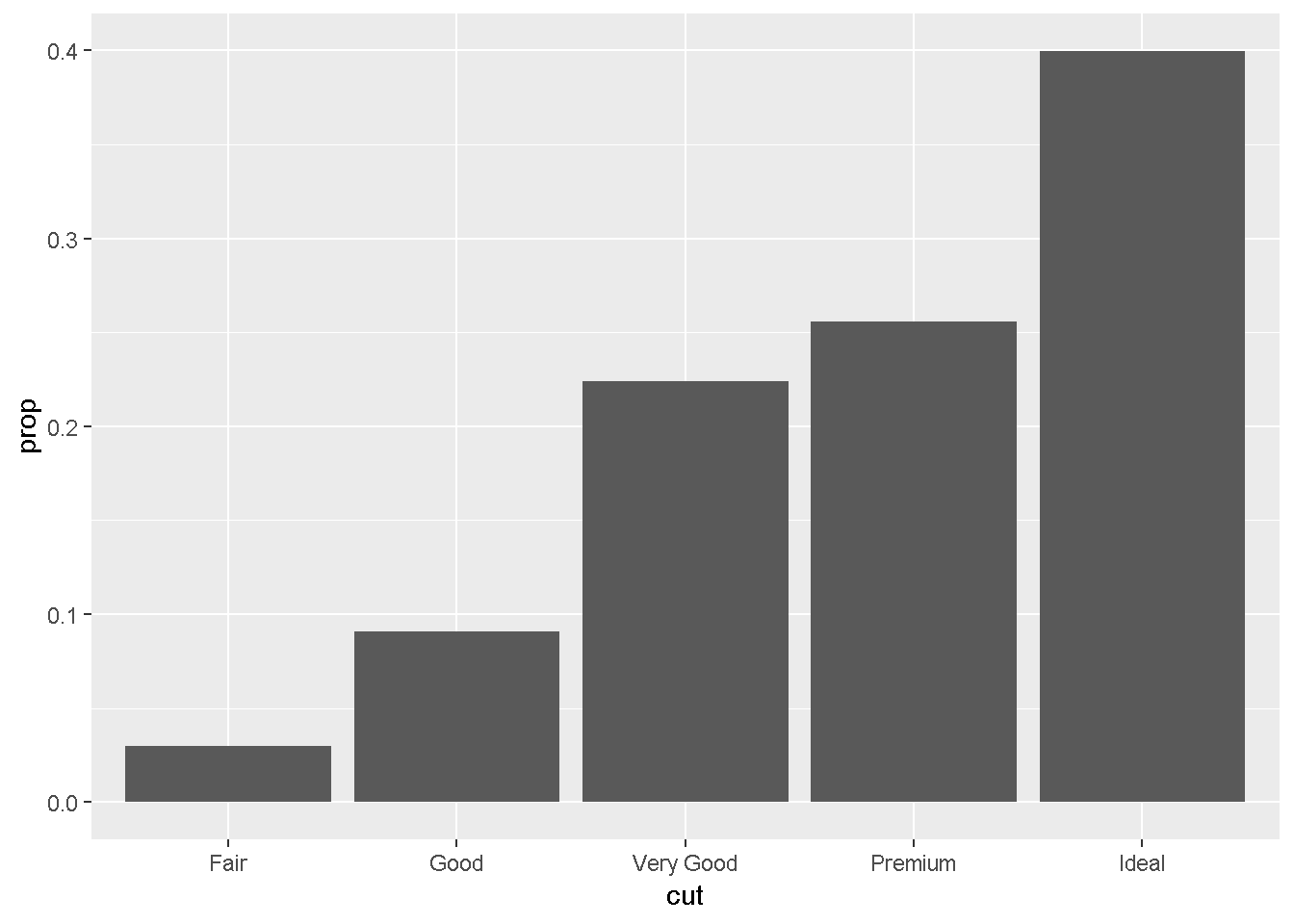
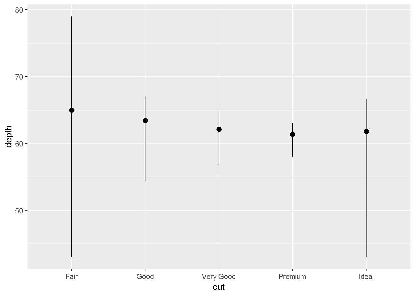
    ggplot(data = diamonds) +
      stat_summary(
        mapping = aes(x = cut, y = depth),
        fun.ymin = min,
        fun.ymax = max,
        fun.y = median
      )
Position adjustments
ggplot(data = diamonds) +
  geom_bar(mapping = aes(x = cut, colour = cut))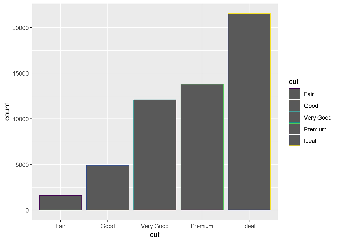
ggplot(data = diamonds) +
  geom_bar(mapping = aes(x = cut, fill = cut))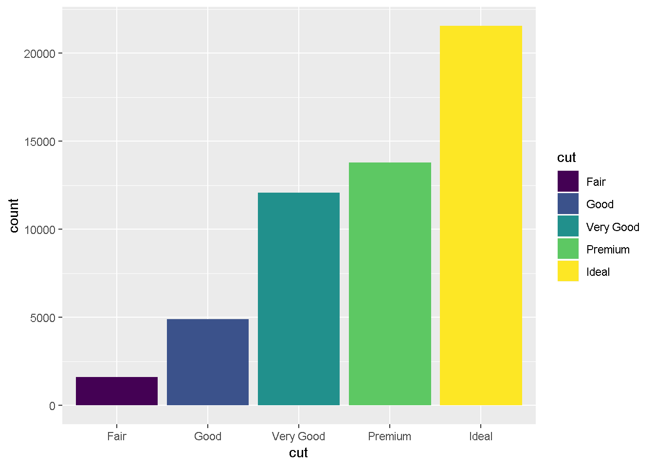
ggplot(data = diamonds) +
  geom_bar(mapping = aes(x = cut, fill = clarity))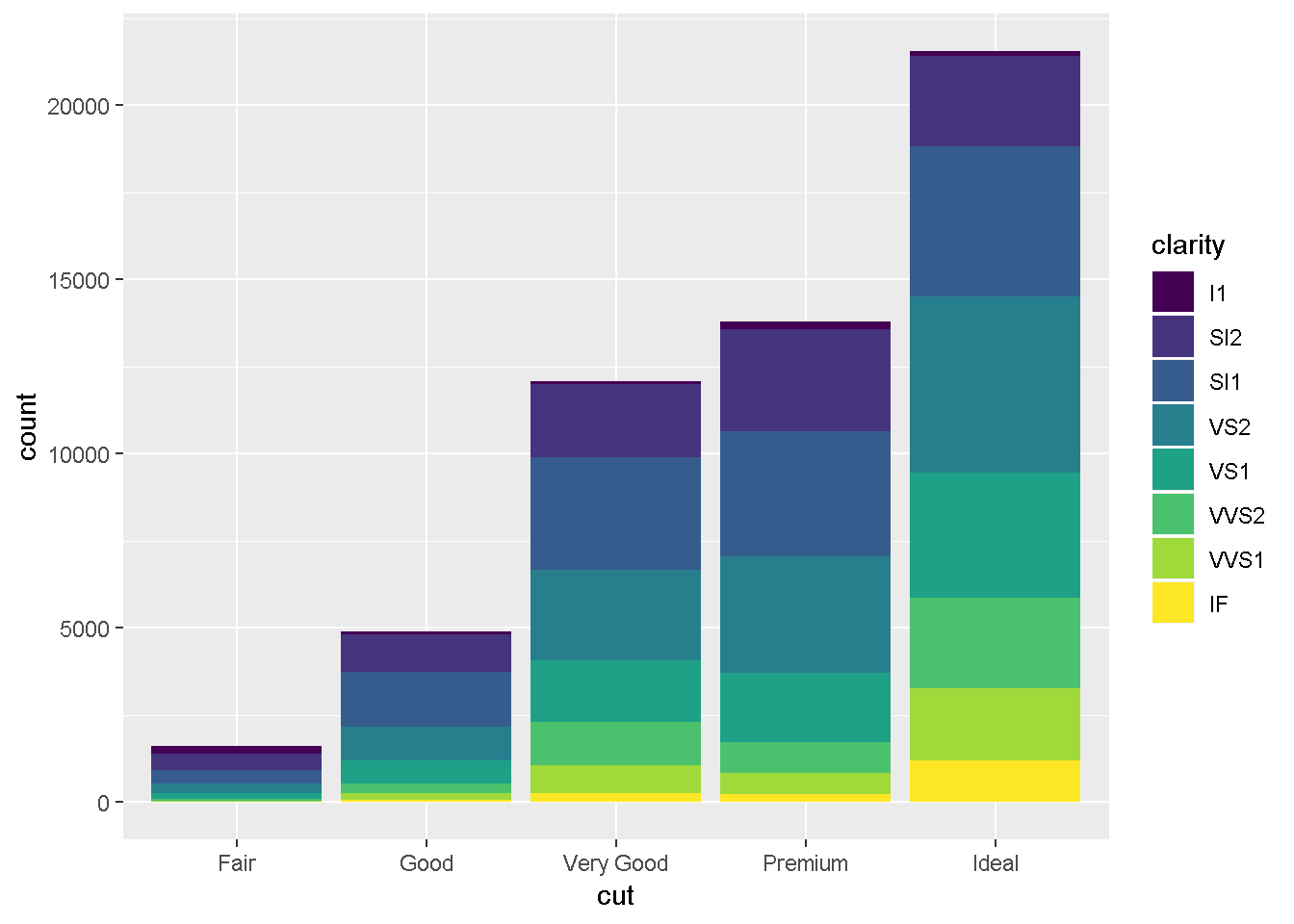
The stacking is performed automatically by the position adjustment specified by the position argument. If you don’t want a stacked bar chart, you can use one of three other options:
"identity","dodge"- or
"fill".
    ggplot(data = diamonds, mapping = aes(x = cut, fill = clarity)) +
      geom_bar(alpha = 1/5, position = "identity")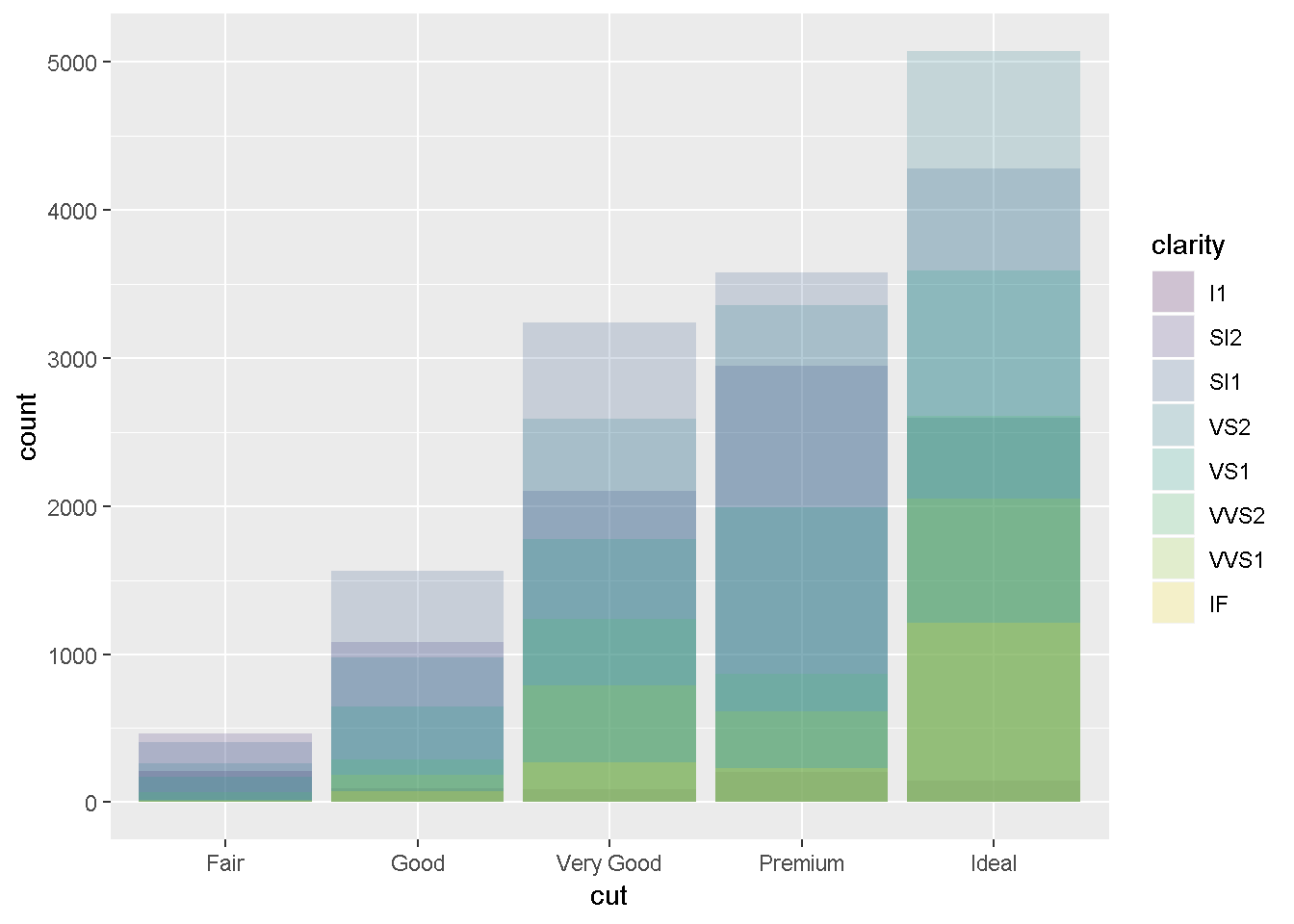
    ggplot(data = diamonds, mapping = aes(x = cut, colour = clarity)) +
      geom_bar(fill = NA, position = "identity")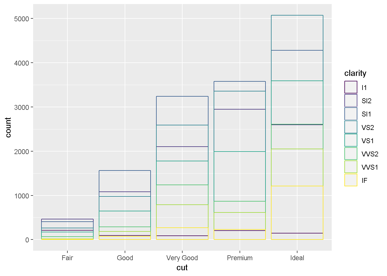
    ggplot(data = diamonds) +
      geom_bar(mapping = aes(x = cut, fill = clarity), position = "fill")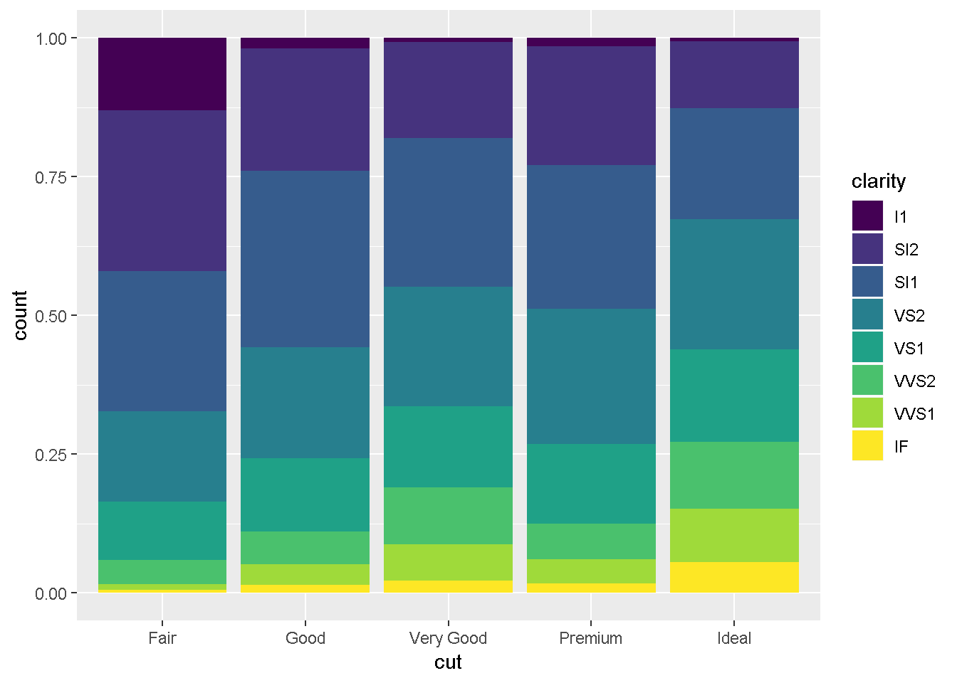
    ggplot(data = diamonds) +
      geom_bar(mapping = aes(x = cut, fill = clarity), position = "dodge")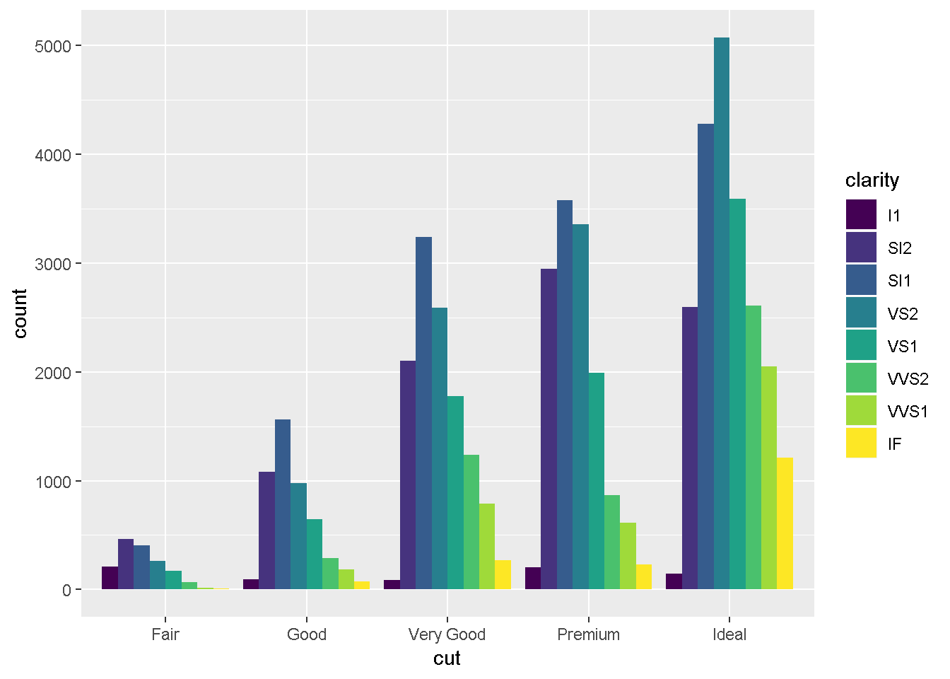
The values of hwy and displ are rounded so the points appear on a grid and many points overlap each other. This problem is known as overplotting.
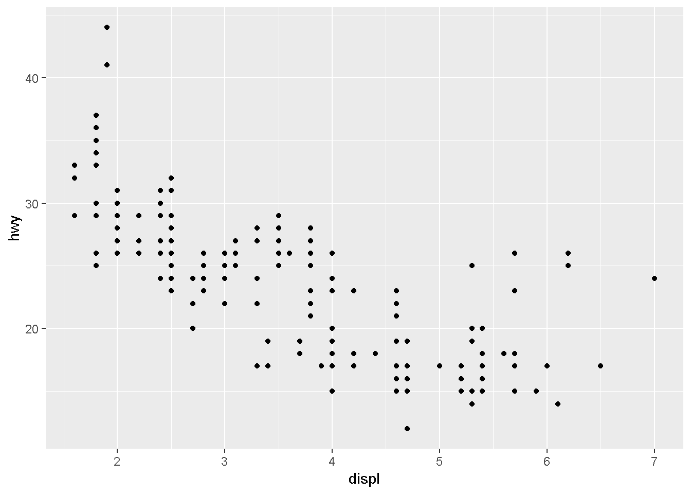
position = "jitter" adds a small amount of random noise to each point.
ggplot(data = mpg) +
  geom_point(mapping = aes(x = displ, y = hwy), position = "jitter")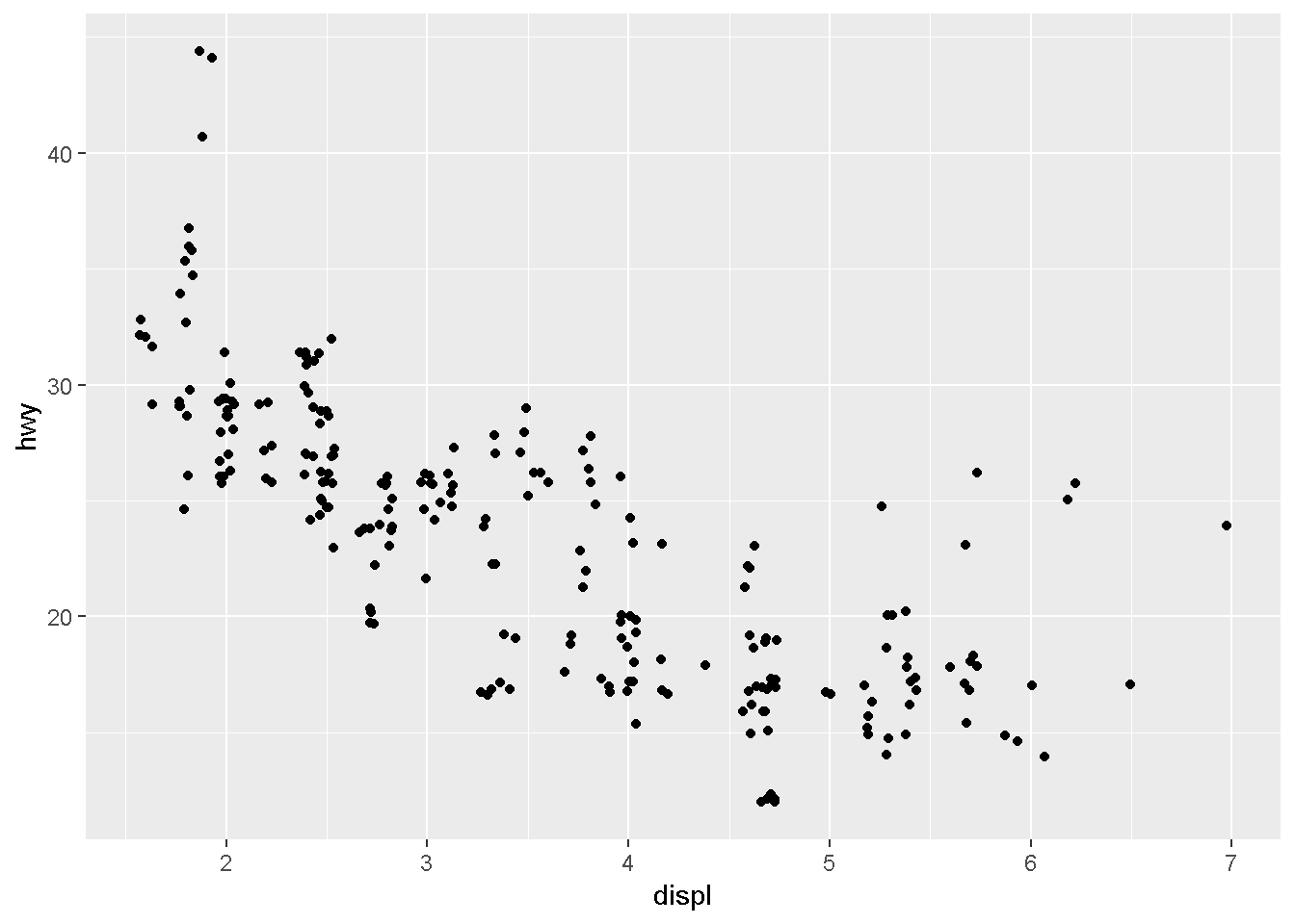
Coordinate systems
The default coordinate system is the Cartesian coordinate system where the x and y positions act independently to determine the location of each point
coord_flip()switches the x and y axes.
    ggplot(data = mpg, mapping = aes(x = class, y = hwy)) +
      geom_boxplot()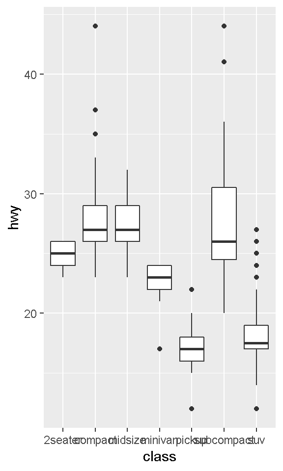
    ggplot(data = mpg, mapping = aes(x = class, y = hwy)) +
      geom_boxplot() +
      coord_flip()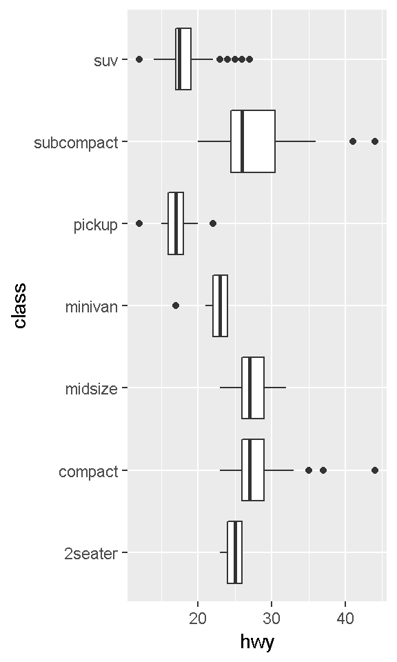
coord_quickmap()sets the aspect ratio correctly for maps.
#install.packages("maps")
nz <- map_data("nz")

ggplot(nz, aes(long, lat, group = group)) +
      geom_polygon(fill = "white", colour = "black")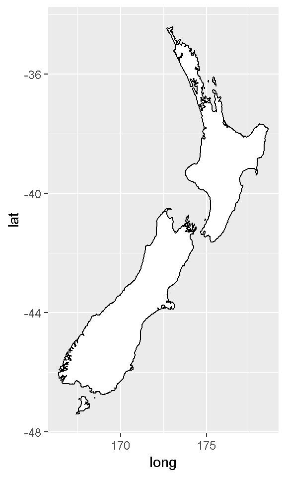
ggplot(nz, aes(long, lat, group = group)) +
      geom_polygon(fill = "white", colour = "black") +
      coord_quickmap()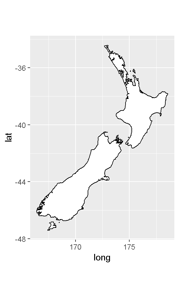
coord_polar()uses polar coordinates.
    bar <- ggplot(data = diamonds) +
      geom_bar(
        mapping = aes(x = cut, fill = cut),
        show.legend = FALSE,
        width = 1
      ) +
      theme(aspect.ratio = 1) +
      labs(x = NULL, y = NULL)

    bar + coord_flip()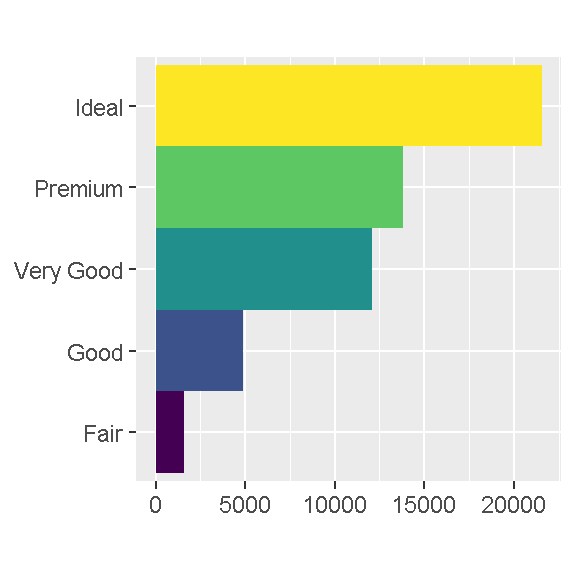
bar + coord_polar()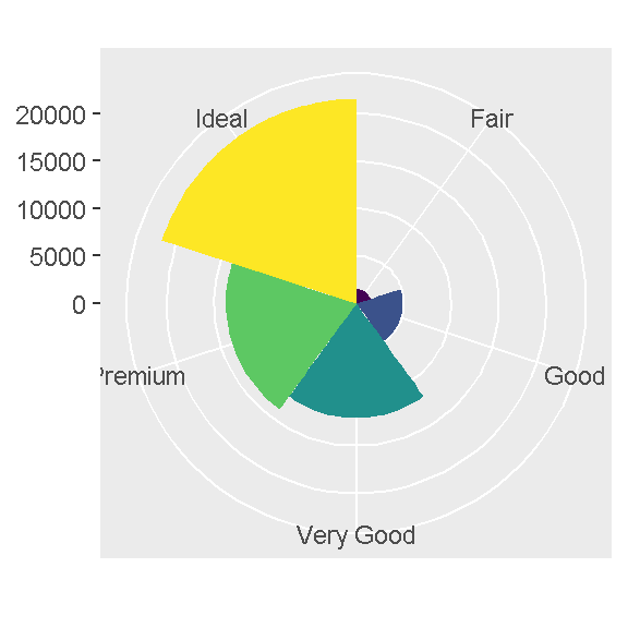
Eurostat
R tools to access open data from Eurostat database
Search and download
Data in the Eurostat database is stored in tables. Each table has an identifier, a short table_code, and a description (e.g. tsdtr420 - People killed in road accidents).
Key eurostat functions allow to find the table_code, download the eurostat table and polish labels in the table.
Find the table code
The search_eurostat(pattern, …) function scans the directory of Eurostat tables and returns codes and descriptions of tables that match pattern.
# install.packages("eurostat")
library(eurostat)
query <- search_eurostat("road", type = "table")
query[3:100,1:2]
Download the table
The get_eurostat(id, time_format = “date”, filters = “none”, type = “code”, cache = TRUE, …) function downloads the requested table from the Eurostat bulk download facility or from The Eurostat Web Services JSON API (if filters are defined). Downloaded data is cached (if cache=TRUE). Additional arguments define how to read the time column (time_format) and if table dimensions shall be kept as codes or converted to labels (type).
dat <- get_eurostat(id = "sdg_11_40", time_format = "num")## Table sdg_11_40 cached at C:\Users\ncloud\AppData\Local\Temp\2\RtmpmmhtcB/eurostat/sdg_11_40_num_code_TF.rdshead(dat)Add labels
The label_eurostat(x, lang = “en”, …) gets definitions for Eurostat codes and replace them with labels in given language (“en”, “fr” or “de”).
dat <- label_eurostat(dat)
head(dat, 10)
eurostat and plots
The get_eurostat() function returns tibbles in the long format. Packages dplyr and tidyr are well suited to transform these objects. The ggplot2 package is well suited to plot these objects.
t1 <- get_eurostat("sdg_11_40", filters = list(geo = c("UK", "FR", "PL", "ES", "PT"), unit = c("NR")))
t1
library(ggplot2)
ggplot(t1, aes(x = time, y = values, color = geo, group = geo, shape = geo)) +
geom_point(size = 2) +
geom_line() +
theme_bw() +
labs(title="Road accidents", x = "Year", y = "Victims")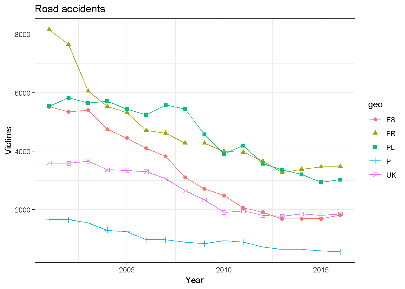
library("dplyr")
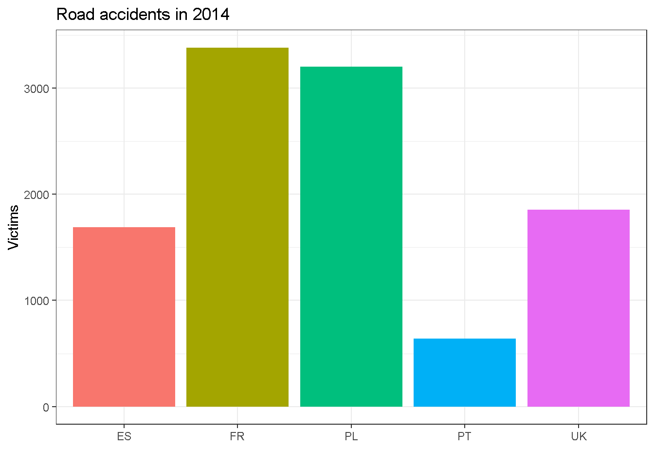
t2 <- t1 %>% filter(time == "2014-01-01")
ggplot(t2, aes(geo, values, fill=geo)) +
geom_bar(stat = "identity") + theme_bw() +
theme(legend.position = "none")+
labs(title="Road accidents in 2014", x="", y="Victims")